
Understanding Your Organization
Your Organization's Climate
Executives have access to a high-level view to understand the aggregate roll-up of the work climate. This is the climate of the organization.
To access, go to: Threats > Work Climate
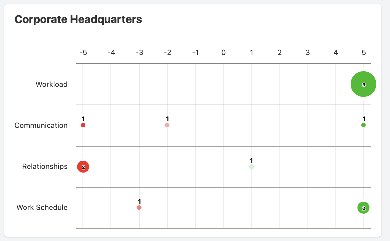
Here you will see diagrams associated with your locations that illustrate your organization's work climate based on different facets (workload, communication, etc.).
The diagram is set for values from -5 to 5, where 5 is the highest and -5 is the lowest employee satisfaction score. Zero indicates neutral status. The size of the circle coordinates with the number of users that submitted the feedback. The circle gets bigger when there are more people. The data presented is based on the user's last submission.
Red circles indicate a work climate problem that you should be aware of and take strategic action over. For example, talking with your managers to understand a situation of poor workload scores. If the workload is expected to persist, hiring more staff or moving people around to compensate.
Filtering & Grouping
Work Climate provides our standard roll-up features. You can look at your data in three ways:
- Aggregate roll-up of your organization
- By Location
- By Group
If you pick a specific location, you will see charts for all groups at that location. If you pick a specific group, you will see charts for that group at all locations.
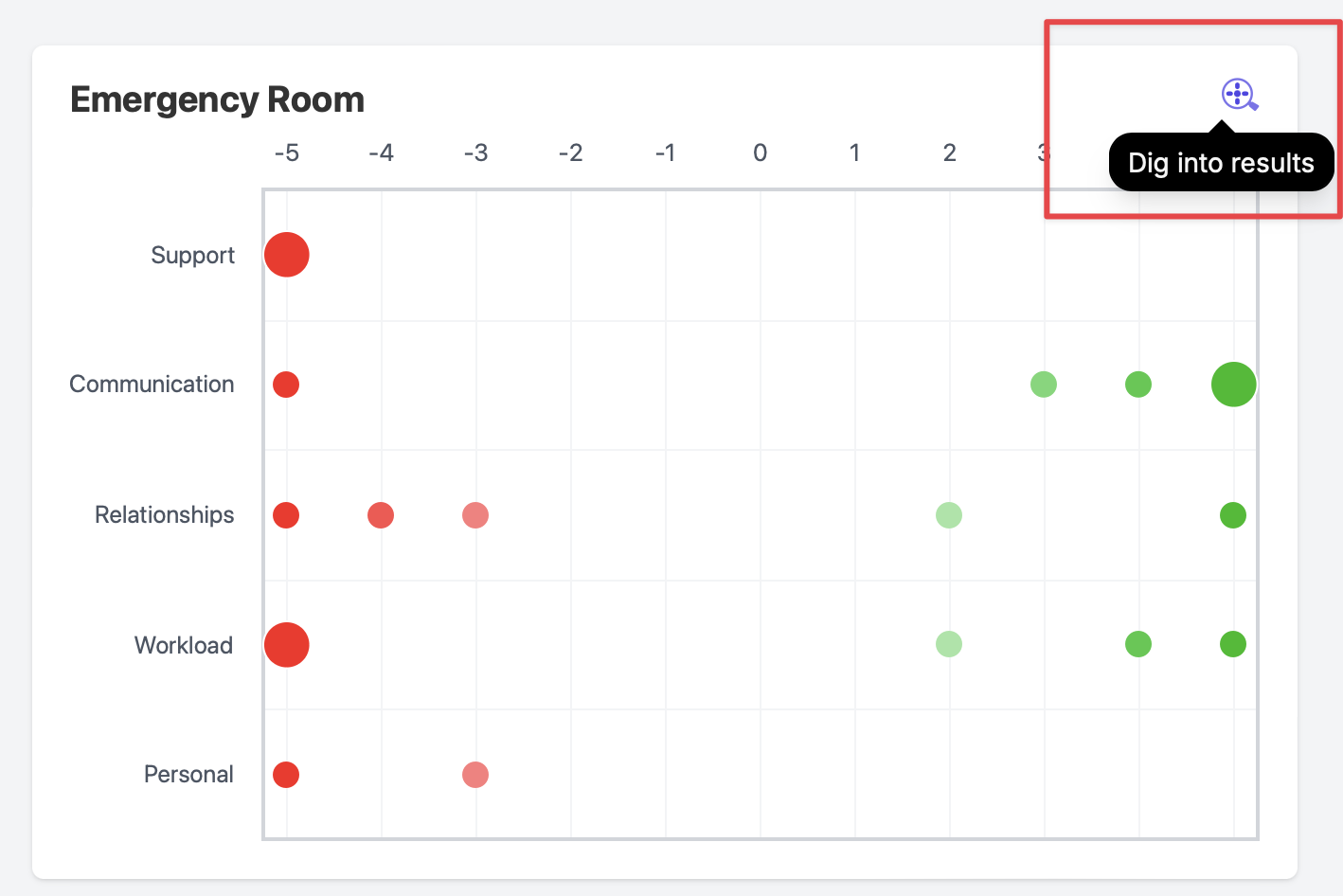
Click on the magnifying glass within the selected group window to dig into the details of the work climate results. You will be taken to the Team Climate page, which is filtered to display the people who make up this segment.
Work Climate Managers Dashboard
The Manager Performance Dashboard is an essential tool for executives to monitor and compare the performance of their managers.
To access, go to: Threats > Work Climate > Managers
** **
**
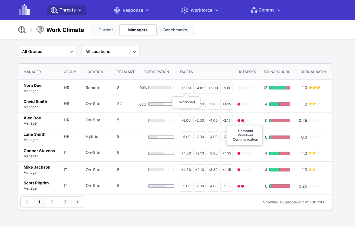
The dashboard displays key work climate performance indicators and statistics for each manager. These include:
- Team Size: The number of team members managed by each manager.
- Participation: The level of team member engagement and participation in work climate submissions.
- Facet Scores: Submissions scores across various facets. Where 5 is the highest and -5 is the lowest employee satisfaction score.
- Hotspots: Areas of concern that may need immediate attention.
- Turnarounds: Instances where a manager has successfully improved a previously negative facet score.
- Journal Ratio: The ratio of climate submissions to journal entries.
These metrics provide a high-level overview of how each manager is performing, making it easy to identify trends and areas of strength or concern. The dashboard facilitates the comparison of different managers' performance metrics. This feature is crucial for identifying high performers and pinpointing areas that may require additional support or improvement.
For more in-depth information, clicking on a manager's row in the list will navigate you to that manager's individual dashboard page. UPDATE link once published Here, you can access detailed performance data and insights specific to that manager.
By utilizing the Manager Performance Dashboard, executives can make informed decisions to enhance management practices and drive organizational success.