
Your Manager Dashboard
This is the personal dashboard for managers to review and analyze their own performance in managing their team's climate.
To access, go to: Workforce> Team Climate> Manager
This tool provides managers with valuable insights into how their efforts are perceived across various dimensions of team climate management. Managers can examine the distribution of scores across each active facet, including Hotspot (red), Negative (orange), Neutral (blue), and Good (green). The scoring range is from -5 to 5, where 5 represents the highest employee satisfaction score and -5 is the lowest. A score of zero indicates a neutral status.
Facet Breakdown
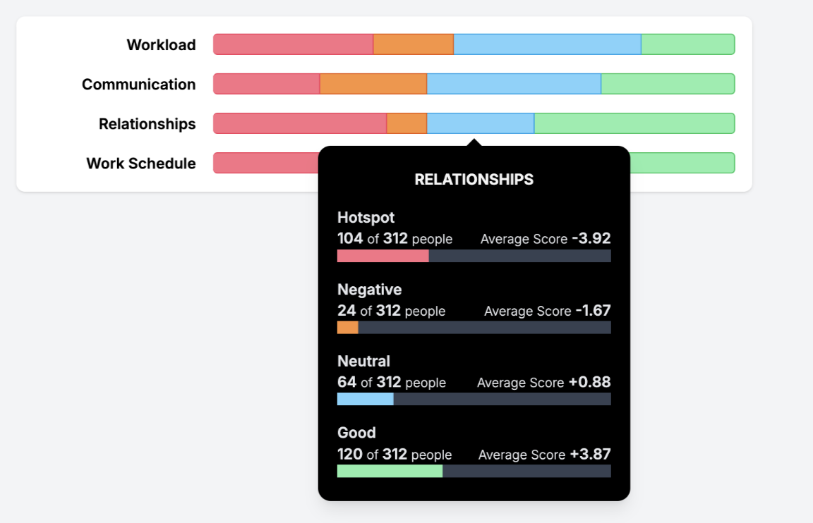
Turnarounds and Team Participation Summaries
To understand "turnarounds", you must first understand "drops". A drop is when a team member was feeling positive about a particular facet and is now feeling negative. They drop from positive to negative (crossing a 0 score and traveling more than 2 points. So +1 to -1 is considered a drop. +2 to 0 and 0 to -1 are both not considered drops.)
So a turnaround is when that team member goes from negative to positive. Ideally, for each drop, there should be a corresponding turnaround. This is "fixing" the root problem.
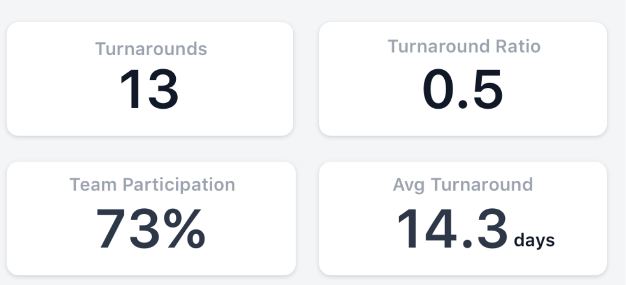
Turnarounds. The total number of times when an issue was resolved within the past 365 days.
Turnaround Ratio. The Turnaround Ratio measures the effectiveness of resolving issues. It is calculated as the ratio of drops (unresolved issues) to turnarounds for the past 365 days. A ratio of 1.0 indicates that every drop has been successfully turned around.
- 1.0: Excellent performance (every issue has been resolved).
- 0.0: Terrible performance (no issues have been resolved).
Team participation. This describes how much trust you can have in your team's work climate scores. Is your whole team participating? If you have high scores, but only a fraction of your team is reporting, do you really have a positive work environment? This participation number is an average of the number of team members who submitted at least once a month for the past 365 days.
- A higher participation rate indicates a more accurate picture of how people feel about their work.
- When there are lower participation rates, look at periodically reminding your team members to send in a submission. Suggestions:
+ Make sure team members have the app installed. + Ask them to turn on weekly climate reminders in the app. + Talk to your leadership about sending out periodic "Benchmarks" that prompt employees to send in submissions.
Avg. Turnaround. Average Turnaround represents the average time taken to resolve issues in days.
- A lower Avg. Turnaround suggests efficient handling of issues.
- A higher Avg. Turnaround may indicate potential areas for improvement in responsiveness and efficiency.
Manager Performance Chart
This chart provides managers with insights into their performance based on two factors. First, it aims to help managers understand the history of each facet, allowing them to see how their performance has trended over time. Managers can determine if their performance is constant, fluctuating, improving, or declining, thus assessing whether they are getting better or worse at managing their team. Second, the chart helps managers understand submission frequency over time. By observing the scatter plot, managers can see if there are many dots, indicating high submission frequency and good adoption, or if submissions are clustered only around benchmarks.
By using this chart, managers can gain valuable insights into their team management performance and take steps to improve their management practices based on historical data and submission patterns.
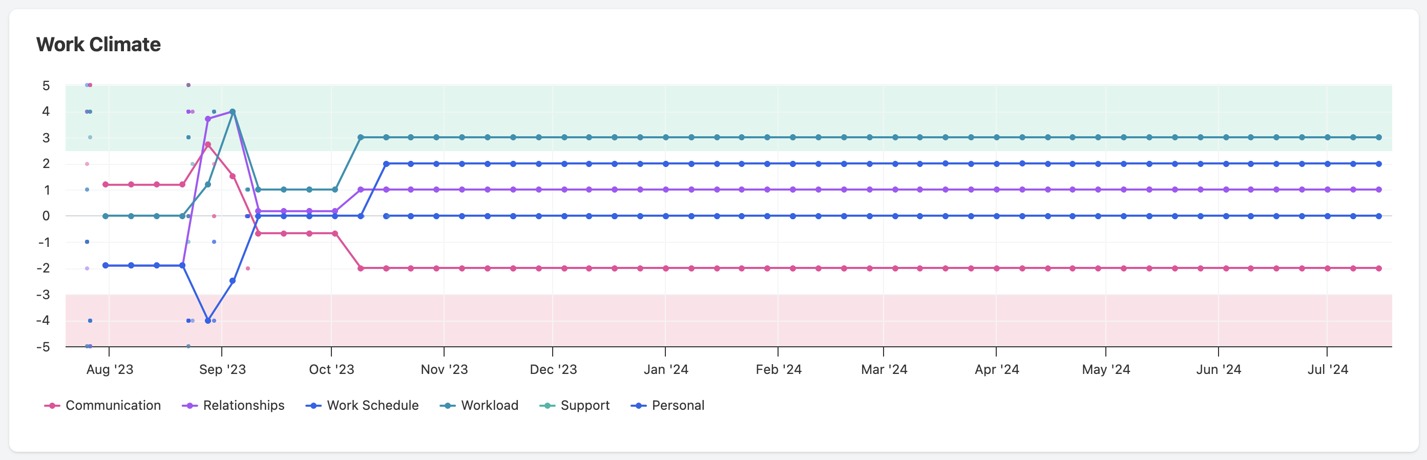
To use the chart effectively:
Identify Trends: Look at the line charts to see the average score trends for each facet over time and determine if your performance is improving, steady, or declining. The chart has a scale ranging from -5 to 5. Scores from -3 to -5 are shaded red to denote very bad scores, while scores from 2.5 to 5 are shaded green to denote very good scores. All facet data is shown, meaning if a facet is not active but has data, it will still be displayed on the chart.
Analyze Submission Patterns: Examine the scatter plot to understand submission frequency. Consistent dots indicate regular submissions, while clustered dots suggest irregular submission patterns. A scatter plot is used to show individual submissions, with each facet having a series representing its submissions.
Evaluate Performance: Pay attention to the shaded areas. Scores in the green zone indicate good performance, while scores in the red zone highlight areas needing improvement.
Mood Swings
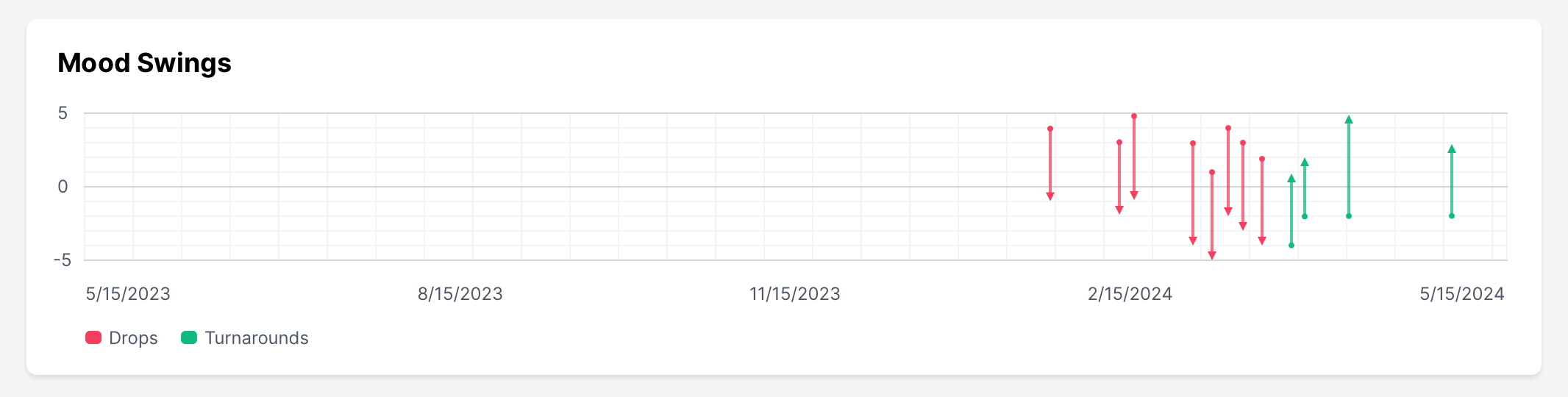
This chart focuses on evaluating the manager by tracking their ability to turn around negative work climate submissions. It aims to visualize how well the manager addresses and improves upon negative feedback. When a new climate submission is received, it is compared to the previous submission.
- A facet's score is classified as a drop if it has decreased by more than 2 points, shifting from a positive to a negative range.
- Conversely, a facet's score is classified as a turnaround if it has increased by more than 2 points, shifting from a negative to a positive range.
Journal Ratio
The goal of this chart is to help managers understand and improve their journaling practices by:
- Monitoring Submission to Journal Entry Ratio: The chart displays the ratio of the number of climate submissions to the number of journal entries made. It highlights whether the manager is meeting the ideal 1-to-1 ratio, where each submission should correspond to a journal entry.
- Visualizing Performance: It uses a green bar to represent the ratio achieved, with any shortfall displayed in red. This visual representation helps managers quickly identify areas where they may be lacking.
- Encouraging Extra Effort: The star system incentivizes managers to journal for those who did not submit feedback. By providing extra credit through stars, the chart encourages additional journaling beyond the basic requirements, rewarding managers for addressing all team members, including those who did not submit feedback.
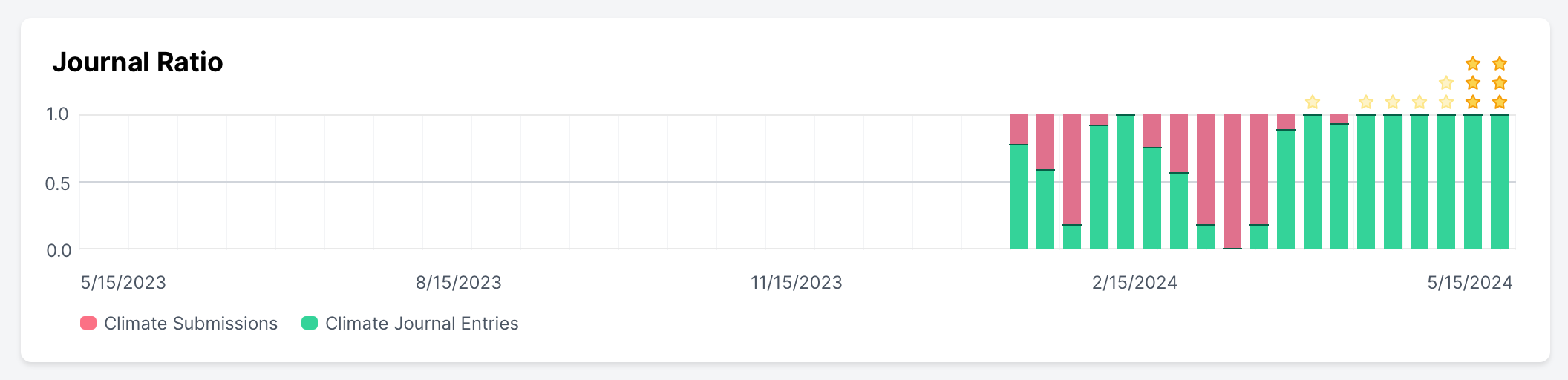
Overall, the chart aims to drive managers towards better journaling practices and greater engagement with their teams.
Team Size
The Team Size chart helps managers understand how changes in the number of team members influence their performance. This allows managers to see trends and make informed decisions about managing their teams effectively.
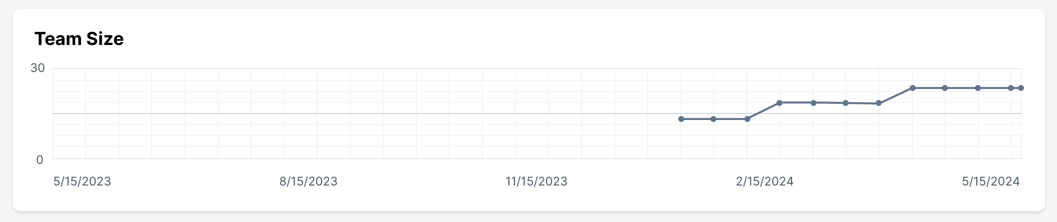
The Apex Vision subscription is required to access the Team Size chart. Contact support@prevailhq.com to add a subscription.
__
Data from the individual team climate managers' dashboards is populated into the Manager Leader Board. This dashboard allows executives and leadership to understand firsthand how well managers are resolving issues with employee climate.